MERIDIAN & CO.
Brand Identity System · 2026

Meridian
& Co.

Makers of precision navigational instruments — sextants, marine chronometers, and celestial tools for those who want a way home that doesn’t depend on a satellite.

Established

Est. 1894 · Plymouth

Positioning

Heirloom-grade · Swiss-watchmaker quiet

This Document

Identity v1.0 — Guidelines

01 — The Mark

The Meridian Arc.

A sextant is, by definition, a sixth of a circle — a 60° arc. The mark takes that defining geometry and fuses it with the navigational meridian: the sight line a sailor holds to find home.

Primary Mark viewBox 120 · r=36
01

The graduated arc

The sextant’s limb — a precision arc with engraved tick marks. It says “instrument,” not “decoration.”

02

The meridian line

The north–south sight axis running true through the centre. The line a navigator holds steady.

03

The horizon index

A short foot at the base — the level, the known reference every sight is measured from.

04

The apex node

A single diamond at the zenith — the sighted body at noon. One point of certainty.

02 — Variations

One mark, every ground.

Drawn in pure geometry with currentColor, the mark converts cleanly to ink, reversal, and single-colour foils — the test of a real logo.

Primary
Obsidian on Vellum — default
Reversed
Vellum on Obsidian — dark grounds
Monochrome
Single-ink — engraving & emboss
Foil
Brass on Obsidian — hot foil
App icon · dark
App icon · brass
Light chip
Favicon · round
02b — World

The objects the brand lives with.

One art-directed set — brass, obsidian shadow, single warm key light. The mark is built to sit beside these, not on top of them.

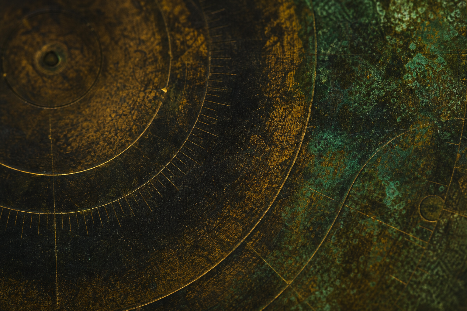
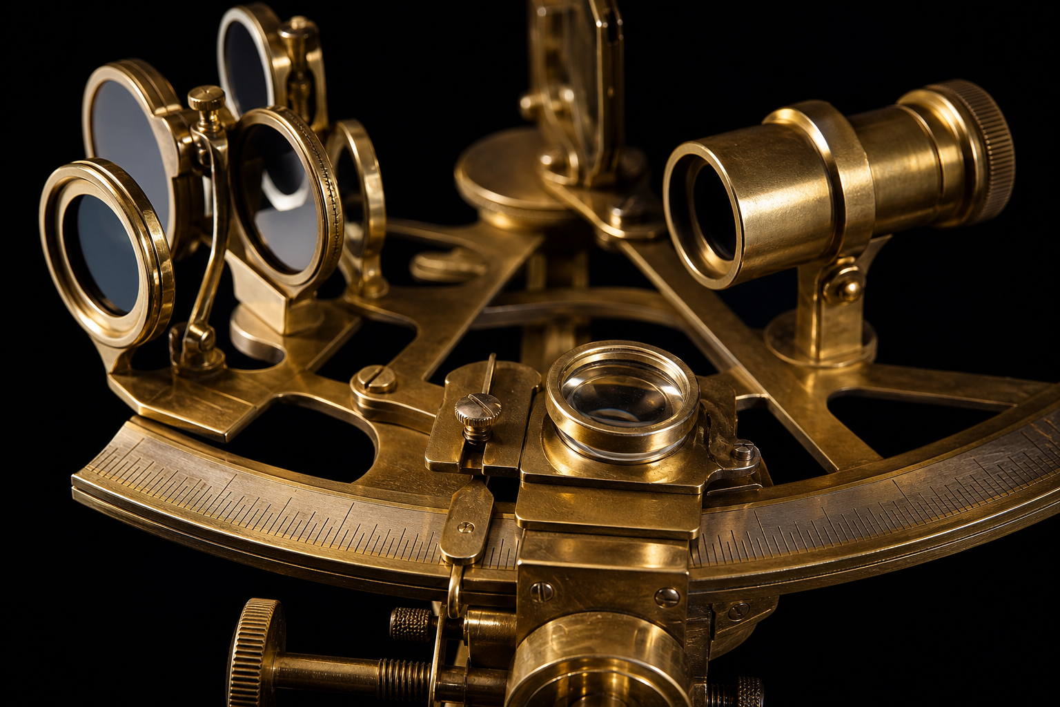
Macro of a brass sextant, graduated arc and Vernier scale
The arc the mark is drawn from — the instrument’s own limb.
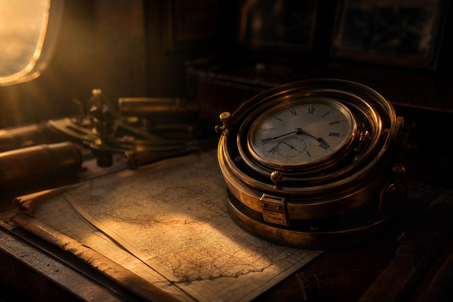
Marine chronometer on aged charts
Chronometer, still life. The object the wordmark was cut to match.
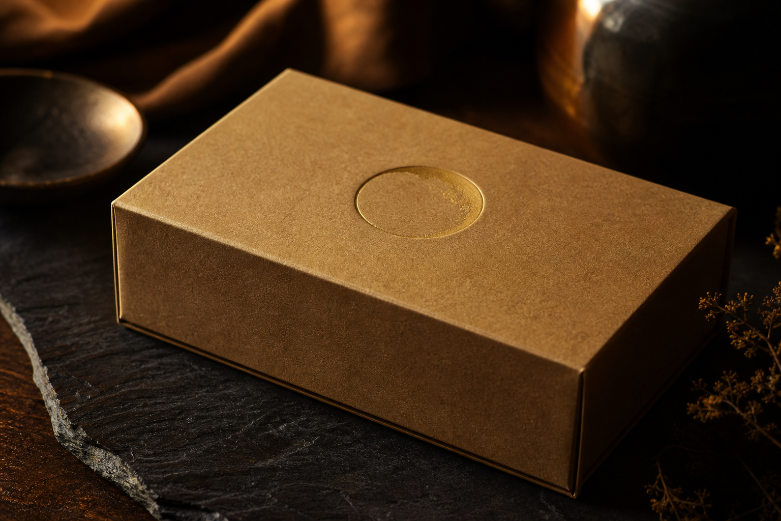
Kraft box with debossed circular mark
Packaging — the mark blind-debossed, never printed loud.
03 — Wordmark

Set in Caslon.

The wordmark uses Libre Caslon Display — a face cut in the same era as the chronometer. The italic ampersand is the only ornament, picked out in Brass.

MERIDIAN & CO. EST · MDCCCXCIV · PLYMOUTH
MERIDIAN & CO.
MERIDIAN
& CO.
EST · 1894
MERIDIAN
& CO.
NAVIGATION INSTRUMENTS

Horizontal lockup for mastheads and signage · stacked lockup for stamps, tags, and small footprints. Clear space on all sides ≥ the height of the apex node.

04 — Colour

Material truth.

The palette is drawn from the objects themselves — brass, steel, vellum, and the green patina brass earns over a century. No navy. No red. Nothing borrowed from a boating catalogue.

Obsidian #0E1116

The ink — the deep black of gunmetal and night skies. Carries all type and structure.

Brass #B0863C

The signature. The metal the instruments are machined from — used as the single accent.

Vellum #F4EFE6

The page. Warm, aged paper — never cold white. The calm ground everything sits on.

Patina #3E6B5E

Restraint itself. The green brass earns over time — used rarely, only where it earns its place.

Ash #8C8478

Secondary text and hairline rules. The quiet support that lets the others speak.

Vellum Panel #ECE5D7

A tonal step down from the page — for cards, wells, and recessed surfaces.

Usage proportion

The system is mostly quiet ground and ink, with Brass as the single voice and Patina as a whisper.

56
24
12
5
3
Vellum — ground56%
Obsidian — ink24%
Brass — accent12%
Ash — support5%
Patina — reserve3%
05 — Typography

Two voices, one ruler.

A classical display serif for the catalog voice, a readable serif for prose, and a precise grotesque for the instruments’ own language — serial numbers, scales, and data.

Display
Libre Caslon Display

Headlines, wordmark, signage. Cut in the Caslon foundry’s 18th‑century style — the era of the chronometer.

A way home, by the stars.

ABCDEFGHIJKLMNOPQRSTUVWXYZ · 0123456789

Text
Spectral

Body copy, captions, prose. A contemporary serif with the warmth of a printed manual.

To take a sight is to hold still — sextant to eye, horizon to mirror, the whole sea held level for one held breath. Our instruments are built to be trusted at that moment, and for the century after it.

Functional
Inter

Data, scales, serials, UI. Tabular figures and a neutral voice for the instruments’ own markings.

MODEL M-IX · SEXTANT — SN 1894‑0042 · CALIBRATED 22·03·2026 · CERT. ±0.1′ ARC

Display / LBy the stars46 / 48
Display / MA way home34 / 38
HeadingThe Meridian Arc24 / 30
SubheadPrecision navigational instruments19 / 26
BodyThe calm ground everything sits on.17 / 28
CaptionCalibrated to one tenth of an arc‑minute.13 / 20
EyebrowEstablished 189411 / 14
Pairing

Caslon leads, Spectral follows. Never set two display faces together — Inter only carries data and labels.

Headline
Set in Spectral, the body voice.
Measure

Body measure stays between 60–75 characters. Longer than a manual page is a sign the column is wrong, not the type.

≈ 66 ch — ideal column
Numerals

Always tabular figures (Inter) for serials, coordinates, and any aligned column. Old‑style figures never on instruments.

50° 22.4′ N · 004° 08.9′ W
06 — In Use

Does it hold?

The test of a system is whether it survives contact with a business card, a hangtag, an engraved plate, and a 29‑pixel icon. All four, built in code from the same mark.

MERIDIAN & CO.

Master Instrument Maker

Helena R. Vance
helena@meridian.co · +44 1752 000 1894

Est. MDCCCXCIV · Plymouth
Business Card90 × 54 mm · Vellum stock, Brass foil
MERIDIAN
& CO.
Model M‑IX Sextant
SN 1894‑0042
Calibrated ±0.1′ arc
Plymouth · 2026
Product TagCotton tape · Brass‑foil stamp
MERIDIAN & CO.
Marine Chronometer
Cal · 2026
No. 0042
Engraved PlateBrass on Obsidian steel
Primary · iOS
Brass variant
Square · Android
App Icon1024 base · scales to 29 px
MERIDIAN & CO.
PackagingKraft · blind‑debossed mark
07 — Rationale

The thinking.

Plainly, why this looks the way it looks.

A sextant is geometry you can hold. So the brand is geometry you can read.

Meridian & Co. makes objects that outlive their owners. The identity had to feel the same way — machined, not printed; considered, not trendy. So everything starts from the instrument itself: the mark is the sextant’s own arc and sight line, the palette is the brass and steel and aged paper the products are actually made of, and the type is set in the classical serif that was current when the chronometer was invented.

The single rule was restraint. One accent colour, never two. One ornament — the italic ampersand — never more. Patina exists in the system but is used so rarely it reads as an event. Nothing nautical is borrowed: no anchors, no rope, no navy‑and‑red. The only signal that this is a marine company is the mark’s own geometry, which is the honest one.

The result is meant to sit next to a Swiss watchmaker on a shelf, not next to a brand of foul‑weather gear. Quiet, precise, and — if it has done its job — unmistakably itself.